Creating a consistent banking experience
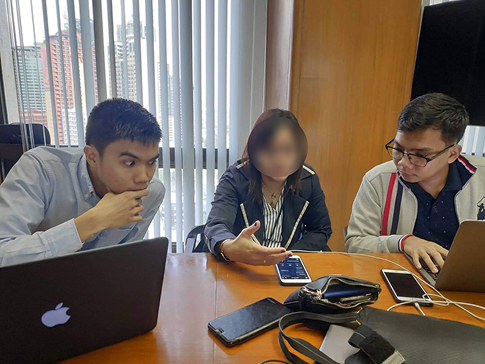
Metrobank wanted to refresh and unify its digital experience across mobile and web, as part of its goal of “Meaningful Banking”. Over a few months with Make Technology, I worked closely with different teams to understand their goals and their views on the customer. What came out of it was a unified design experience that helped the launch of their app in 2023.
The Challenge
Metrobank’s digital platforms, both web and mobile, had grown separately over time, resulting in an inconsistent and fragmented user experience. With the bank's rebrand to “Meaningful Banking,” they needed a digital experience to align with this positioning.
Singlife needed a simple, affordable, and scalable medical insurance product that could perform better than existing offerings and appeal to a broader segment of customers — all within a tight two-month delivery window.
Research Methods
Research
Stakeholder Interviews
We spoke with multiple business units to align on goals, constraints, and definitions of success. Key questions included:
- “What are your team’s KPIs?”
- “What must this redesign get right?”]
- “What do you know about your audience today?”
This surfaced overlapping issues across the organization — from visual inconsistency to scalability limitations.
Research
Usability Testing
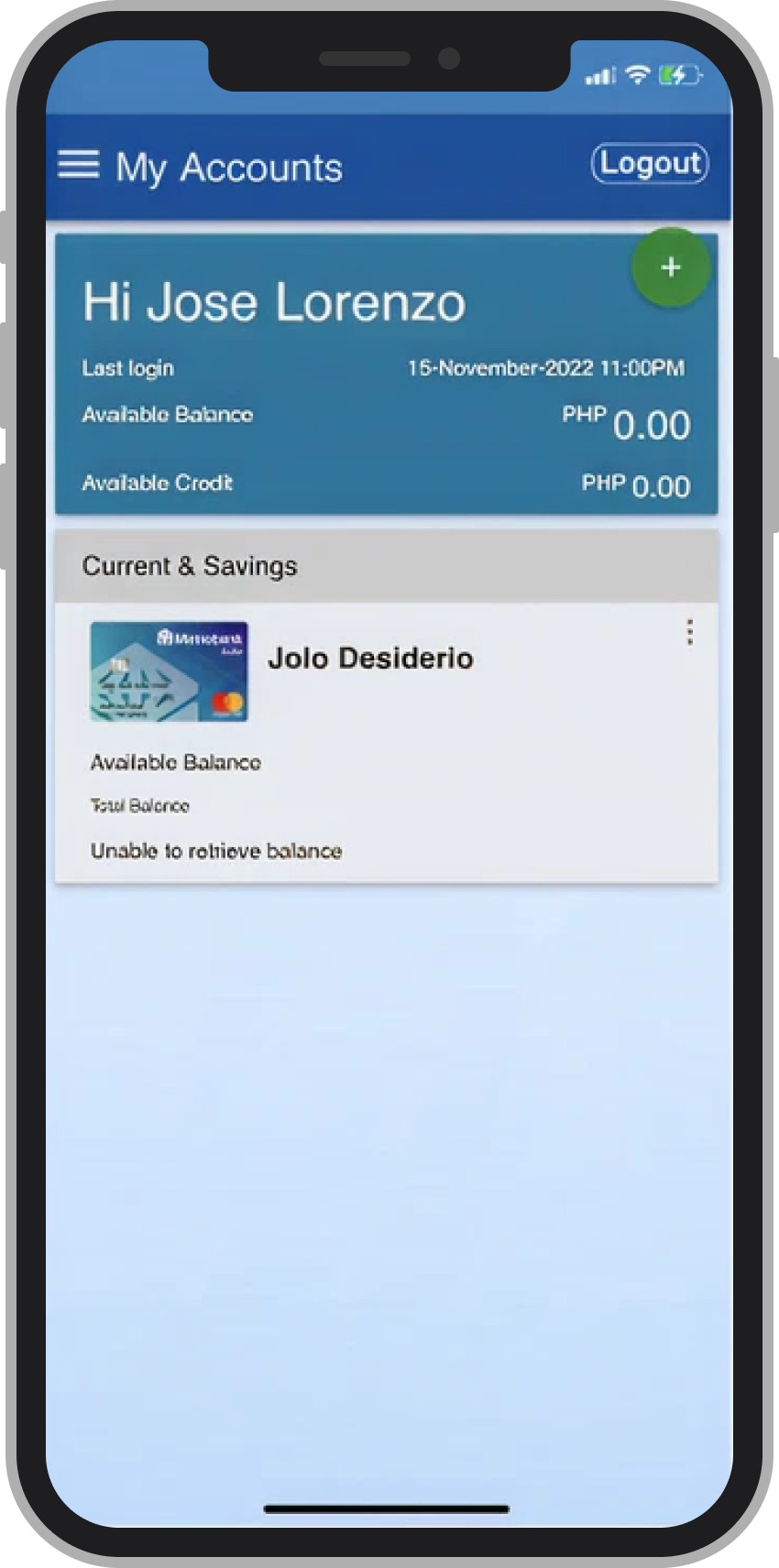
We tested the current mobile and web platforms to identify pain points:
- Users struggled with unclear navigation and redundant flows
- Lack of visual hierarchy made task completion difficult
- Interaction patterns varied too much between platforms

Design Approach
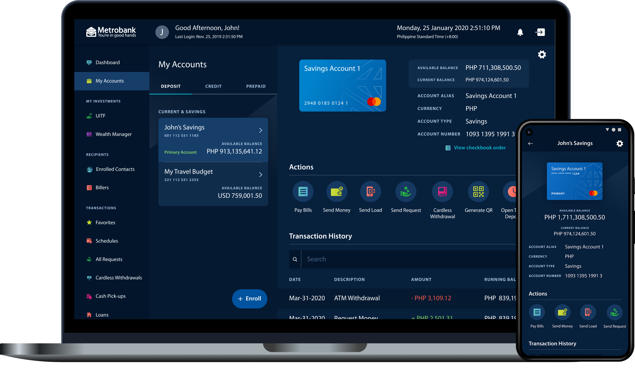
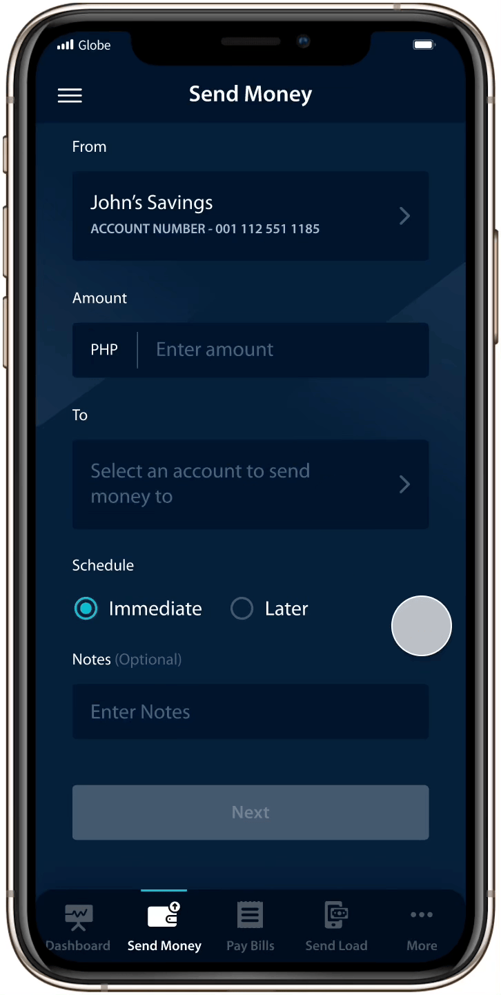
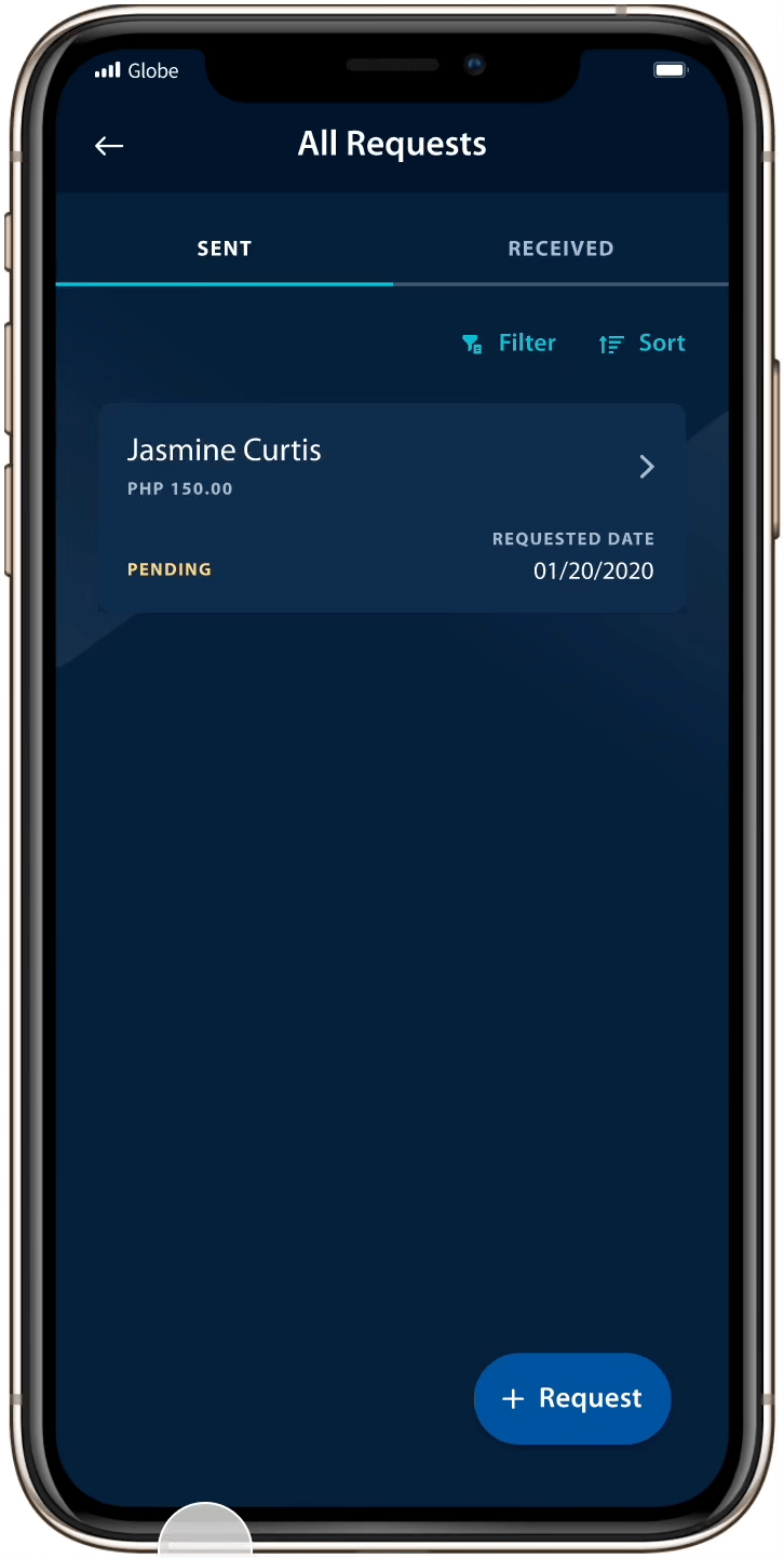
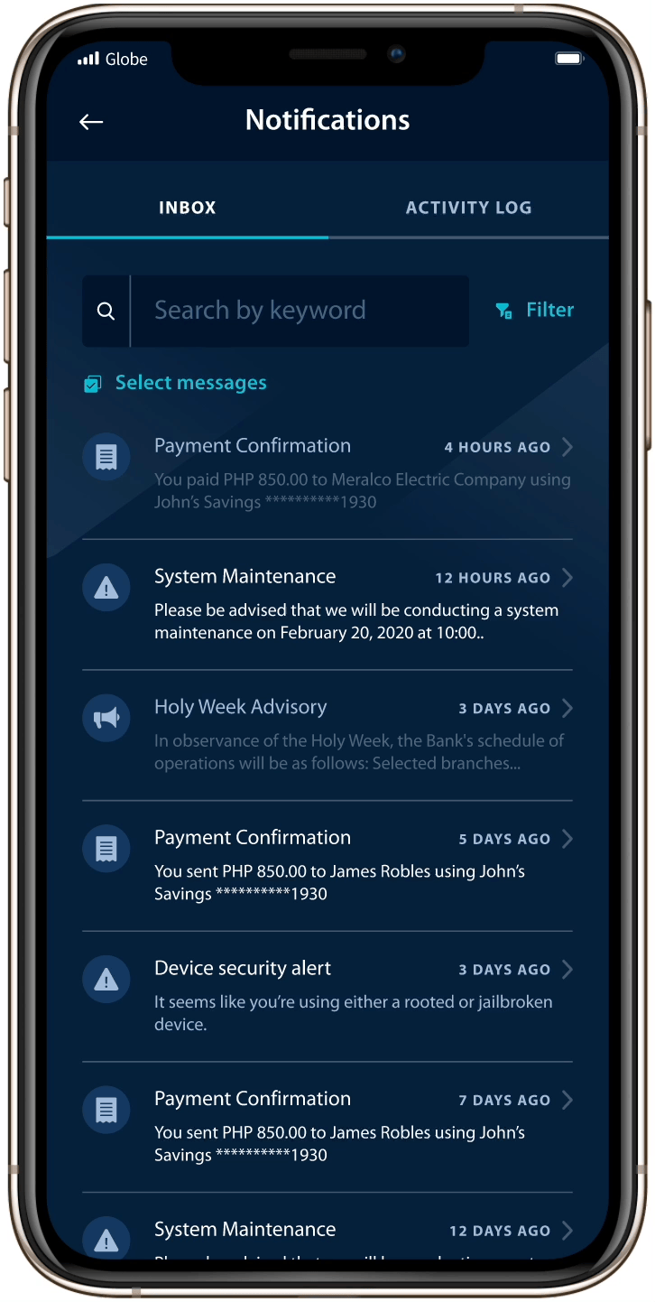
Consistency
We spent some time building a library of components, making it easier to keep things consistent.
Responsive Design
Whatever we designed, we accounted for how the experience would look and behave across different devices.
Light and Dark Mode
Accessibility was a key priority for Metrobank, leading us to design both light and dark mode versions. Our pattern library made it possible to provide these efficiently.
Details

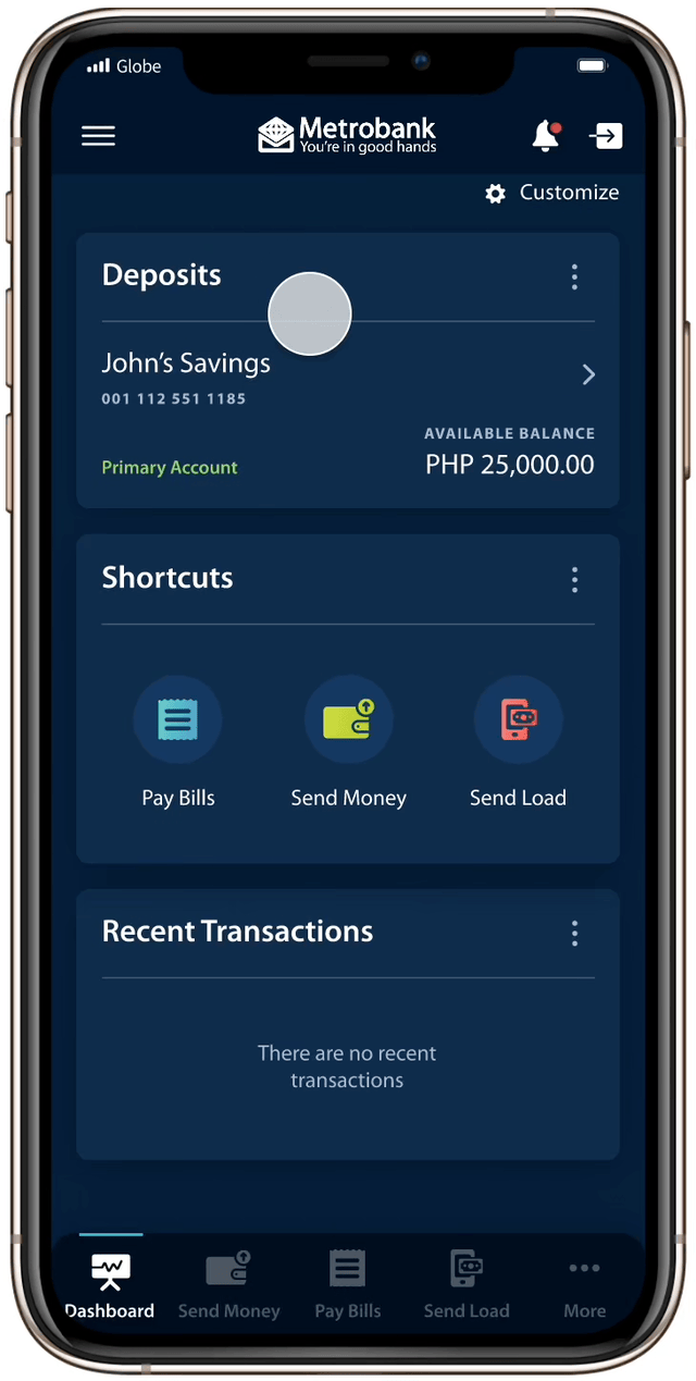
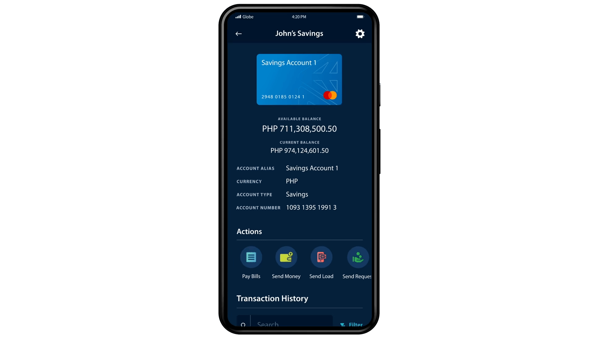
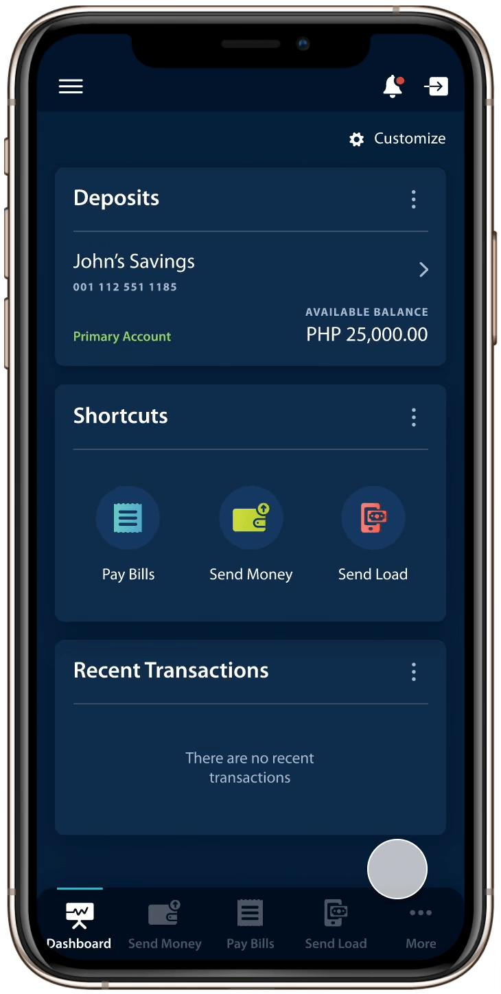
The Outcome
A Successful Launch
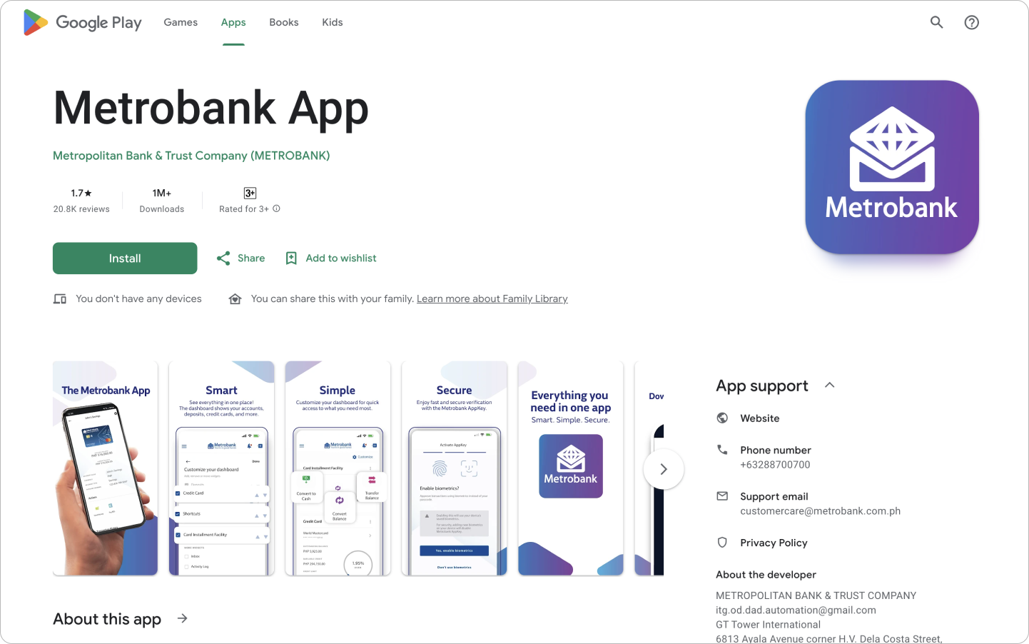
Although our engagement ended after handing off the designs, it was rewarding to see Metrobank launch their new app using the screens that our team created.